Simplifying app access for employees using Okta
- Role
- Product Designer
- Focus
- Workforce Identity · End-User Experience · B2B SaaS
- Problem
- As employees gained access to more apps, they couldn’t tell whether they had an app and couldn’t find it, didn’t have access, or needed to request it.
- My role
- Product Designer. Problem framing, information architecture, navigation, search, card hierarchy, responsive behaviour, prototyping and testing.
- What changed
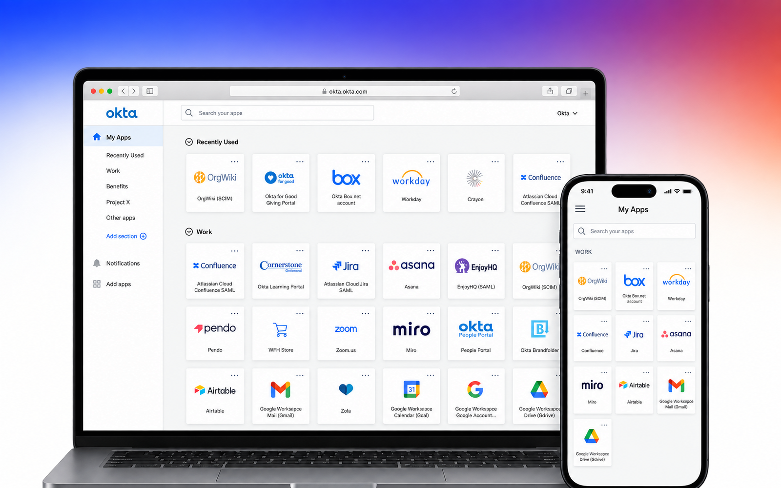
- Tabs became sections on a single page. Application cards were made scannable. Search was refocused on known intent. One organising model across desktop and mobile.
- Result
- Employees found and launched applications around 50% faster in testing.
What is the End-User Dashboard?
For many employees, Okta is the starting point for their working day. It is where they go to find and launch applications their organisation has given them access to, Slack, Salesforce, Google Workspace and sometimes dozens of other internal tools.
For a long time, that experience was relatively simple. But as organisations added more applications and Okta became responsible for more of the employee identity experience, the dashboard had to do more than display a collection of app icons. It had to help people understand what they had access to, find what they needed quickly and know what to do when something wasn’t there.
That was the context behind the End-User Dashboard redesign.
My contribution
I worked as the Product Designer on the End-User Dashboard redesign, helping shape the experience from early problem framing through to testing and delivery.
My role was to turn what we were learning from employees, administrators and product data into a clearer direction for the dashboard. I worked through the information architecture, navigation, application organisation, search behaviour, card hierarchy and responsive experience, using flows and prototypes to understand how those decisions affected the product as a whole.
I worked closely with our UX researcher during usability studies, with the PM to connect user problems with the wider product and access-management context, and with engineering to make sure the direction could work within the existing platform.
A big part of my contribution was deciding which problems design could actually solve. Rather than treating every point of friction as a UI issue, I helped separate usability problems from knowledge gaps, policy constraints and missing product capabilities. That distinction influenced what we redesigned, what needed clearer guidance, and what had to be addressed elsewhere in the product.
The dashboard stopped scaling
The dashboard was becoming harder to use as it grew. As employees gained access to more applications, the dashboard became harder to navigate. Apps were organised across different tabs, search was not always helping people reach the right result quickly, and the experience did not always make it obvious what was available to an employee.
That created a simple but important problem. Someone could come to Okta looking for an application and still leave unsure whether they already had the app but could not find it, whether they did not have access to it, or whether they needed to request access first.
Our product analytics were also showing friction around finding and launching applications, which mattered because that is one of the most basic things the dashboard exists to help people do. At the same time, the PM was hearing another side of the problem from administrators.
Admins were responsible for deciding who should have access to what, while employees could sometimes wait days for access to be reviewed or approved. The employee saw: “I need this application.” The administrator saw: “Who needs access, to what, and why?”
The redesign had to work between those two realities.
Not every problem is a design problem
Before redesigning anything, we needed to understand what kind of problem we were looking at. One thing I wanted us to avoid was assuming every point of friction was a usability issue. I worked with our UX researcher to look more closely at where users were struggling across access and account-related journeys.
A user getting stuck could mean very different things.
Usability
the interface itself was difficult to understand.
Knowledge
the interaction was clear, but the user did not understand what an option meant or what they were expected to do.
Policy
what the user wanted to do was restricted by their organisation’s configuration.
Missing capability
the experience exposed something the product could not support yet.
We saw this particularly clearly when looking at users trying to recover their accounts. At first, some of those failures looked like problems with the recovery interface. But after testing and looking more closely at what people were doing, we found that changing the UI alone would not solve every case.
That distinction became important throughout the work. Instead of asking: “How do we redesign this screen?” we started asking: “What is actually stopping this person from moving forward?”
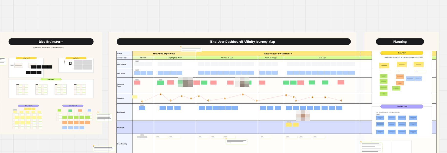
Workshop board from the End-User Dashboard project. We brainstormed as a group, mapped what employees do, need and feel at each stage of using the dashboard, then turned that into priorities. Most of the frustration appeared early, before people got anywhere near search.
Research reframed the work
Research changed how we framed the dashboard. We combined moderated usability testing with product analytics, support signals and what the PM was hearing from administrators. The research gave us a clearer picture of the dashboard experience.
Finding an application was not one isolated search problem. Navigation, organisation, visibility of access and the amount of information on the page were all contributing to how easily someone could get to what they needed.
That changed the scope of the work. Rather than treating search, navigation and app cards as individual improvements, we started looking at the dashboard as one connected experience.
The question became: “How could the dashboard make an employee’s available applications easier to understand before they even needed to search?”
Working across research, product and engineering
I worked closely with research, product and engineering to move the direction forward. I was not making those decisions in isolation. I worked with our UX researcher to understand behaviour and test assumptions, with the PM to balance employee needs against what administrators were telling us, and with engineering to understand what could realistically change within the existing product architecture.
That collaboration became particularly important as the redesign became more structural. Changing the way applications were organised affected navigation, search, responsive behaviour and how existing users would understand the dashboard.
So rather than jumping straight into high-fidelity screens, I used flows and prototypes to explore how those pieces should work together. As we tested different directions, we could keep the parts that reduced friction and challenge the ones that were only making the interface look cleaner without actually making it easier to use.
Rethinking how apps are organised
The dashboard needed a better way to organise applications. One of the biggest questions was how we organised apps. The existing experience relied heavily on tabs.
Tabs gave users a way to separate applications, but as the number of apps increased they also meant people had to move between different views and remember where things had been placed.
That led to one of the main changes in the redesign.
Sections are the new tabs
Instead of asking employees to move between separate tabs, I explored bringing those groups of applications into sections within the same dashboard. The idea was simple: let the page itself communicate how applications were organised. Employees could scan through their available apps without repeatedly switching views, while still keeping meaningful groups separate.
It also reduced some of the memory burden. Rather than having to remember which tab an application belonged to, employees could see the relationship between groups and applications directly on the page. This was not just a visual change from tabs to sections. It changed how the dashboard could scale as employees gained access to more applications.
Making applications easier to scan
Changing the organisation of the page also gave us an opportunity to rethink the application cards. If the dashboard was going to show more information within one view, individual applications needed to remain easy to identify. We explored larger cards, stronger application names and icons, and spacing that made the dashboard easier to scan without making it feel unnecessarily dense.
The goal was not to make the cards bigger for the sake of it. It was to shorten the moment between recognising the application you need and launching it.
Search should not rescue the navigation
Search still mattered, but it should not have to rescue the navigation. Search was another important part of the redesign.
Previously, it could become the fallback when someone could not work out where an application lived. But good search should help someone who already knows what they are looking for. It should not compensate for poor organisation everywhere else.
So we looked at search alongside the new dashboard structure rather than treating it as a separate feature. Sections made browsing easier. Search supported direct intent. Together, they gave employees two clearer ways to get to an application depending on whether they knew exactly what they needed.
Beyond desktop
The experience had to work beyond desktop. The dashboard could not only make sense on a large screen.
Employees also access Okta from mobile devices, where the same number of applications and sections have far less space to work with. That meant we had to think about hierarchy differently rather than simply shrinking the desktop layout.
The organisation of sections, application cards and navigation still needed to make sense on a smaller screen without creating one long, overwhelming page. Desktop and mobile were therefore designed as parts of the same system, with the same mental model carrying across both.
Testing the redesign
As the direction developed, we used prototypes to test whether the new structure was actually making the dashboard easier to understand.
We looked at whether people could recognise how applications were grouped, find an application without unnecessary navigation, understand what was available to them and move through the dashboard without needing to learn a completely new way of using Okta.
Feedback from research helped us refine the hierarchy, organisation and interaction patterns before the experience moved further into delivery.
The important part for me was making sure we were not validating whether people liked the redesign. We were testing whether it actually made the core task, finding and launching an application, easier.
What changed
What changed after the redesign. The final direction brought several changes together rather than relying on one feature to solve the problem.
Applications were easier to scan. Sections reduced the reliance on tabs and gave employees a clearer view of their available apps. Search had a more focused role in helping someone reach a known application. The larger cards and clearer hierarchy made the dashboard easier to navigate visually. And the same organisation model could carry across desktop and mobile.
Before
- Apps split across tabs
- Small, uniform app cards
- Search used to rescue lost users
- Desktop layout shrunk for mobile
After
- Apps grouped in sections on one page
- Larger cards with clearer names and icons
- Search focused on known intent
- One organising model across both
In usability testing, employees found and launched the applications they needed around 50% faster than in the existing dashboard.
What I took from it
The biggest lesson from this project was that once the dashboard started growing, the problem was no longer just search or navigation in isolation. The way applications were grouped, how people scanned the page, how much they had to remember, and how search supported them were all affecting the same task: getting to the right application quickly.
That is what made the move from tabs to sections important. It was not simply a cleaner layout. It reduced the need to keep switching views and remembering where an app had been placed, while giving the dashboard a structure that could handle more applications as organisations grew.
I also learned to design for different behaviours. Some employees knew exactly what they wanted and went straight to search. Others were browsing or trying to remember what they had access to. The dashboard had to support both without making one compensate for the other.
And on mobile, the lesson was that responsive design could not just mean shrinking the desktop version. We had to preserve the same organisation and mental model while changing the hierarchy for a smaller screen. For me, the strongest outcome of the work was creating a dashboard structure that was easier to understand now, but also had room to grow without becoming harder to use.

Project details
- Company
- Okta
- Role
- Product Designer
- Product area
- End-User Dashboard
- Industry
- Identity & Access Management
- Product type
- B2B SaaS · Enterprise · Workforce Identity
- Responsibilities
- Product Design · UX · Interaction Design · Research Collaboration · Prototyping
- Collaboration
- Product Management · Engineering · UX Research